Do you ever find yourself stumped on what colors coordinate with ©Stampin’ Up!’s Designer Series Paper? Thankfully, Stampin’ Up! takes the guess-work out for you so you don’t waste time trying to find the right coordinating colors. Because of this, you will find with every pack of Designer Series Paper, there is a label on the outside of the packaging indicating all the coordinating colors. “But Stephani, all the coordinating colors are listed in the catalog.” Yes, but who wants to keep pulling out their catalog every time you want to check the colors? Not me! I spend enough time trying to come up with a card idea. Ooh, now that is a great topic for another post. 😛
My Tip To You
If you remove the paper from the cellophane wrapper, make sure to cut the label and keep it with your Designer Series Paper. The image below is what the label looks like on every paper packaging. The coordinating colors are listed near the top.

Sample Card
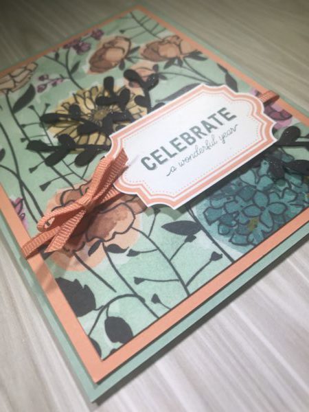
Here is a quick and simple card I made using Share What You Love Specialty Designer Series Paper and choosing a couple coordinating colors.

The Designer Series Paper sheet I used from the Share What You Love pack has about ten different colors along with some neutrals to coordinate with the different paper sheets. I love using Designer Series Paper because it helps when making quick and simple cards. For this card, I chose Mint Macaroon as my card base and Grapefruit Grove as the accent color. For the stamped sentiment I used Tranquil Tide and then added some embellishment with Grapefruit Grove ribbon and then punched out some sprig leaves using the new Sprig Punch that will be available in this years (2018) Holiday Catalog.
Product List
|
|
|
|||
|
|
|
If you enjoyed this card, you might also like this card. Take note of similar color families. I must really like coordinating blues with oranges. LOL! 🙂 But in all honesty, I love the ease of choosing coordinating paper to go with Stampin’ Up!’s Designer Series Paper.
Take a Closer Look
Here is a closer look at what I did to jazz up my card. However, this photo doesn’t make it clear but I added clear Wink of Stella to the Sprig leaves to give the card a little shine.

Steps
- Mint Macaron Cardstock cut to 4 1/4″ x 11″ and scored down the middle at 5 1/2″ to create the card base.
- Grapefruit Grove cardstock cut to 4″ x 5 1/4″ and set aside for step 3.
- Share What You Love Designer Series Paper cut to 3 3/4″ x 5″ and here to Grapefruit Grove.
- Before, adhere the mat to the card base, cut a piece of Grapefruit Grove ribbon and wrap around the card mat then adhering to the card base.
- Next, adhere the top of the card to the card base.
- Using the Labels to Love stamp set, stamp the sentiment and punch it out using the coordinating Everyday Label Punch.
- Punch out a couple Basic Black leaves using the Sprig Punch and color over them with your clear Wink of Stella brush.
- Last, add some Stampin’ Dimensionals to pop up the sentiment and adhere over the ribbon and then last, glue the sprig leaves behind your sentiment.
Before you go, I hope you enjoyed todays card and if you haven’t already, be sure to scroll back up to the top and sign up for my mailing list. This will make sure you don’t miss any of my blog posts. 🙂
Happy Stamping,
Stephani Rogers – SoCal Stamper


Leave a Reply